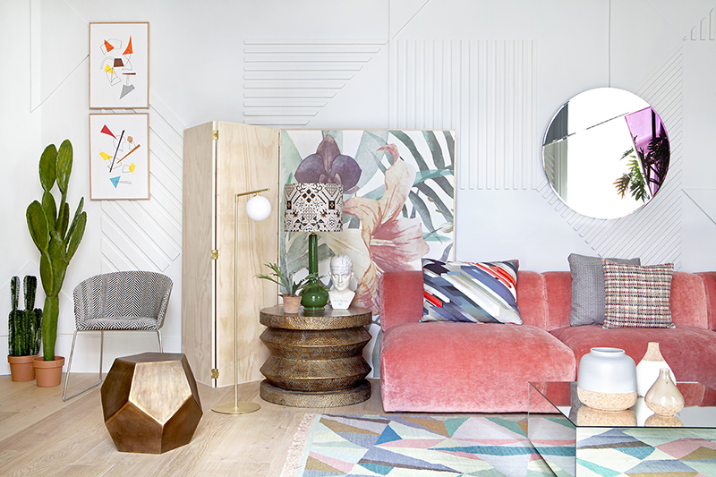
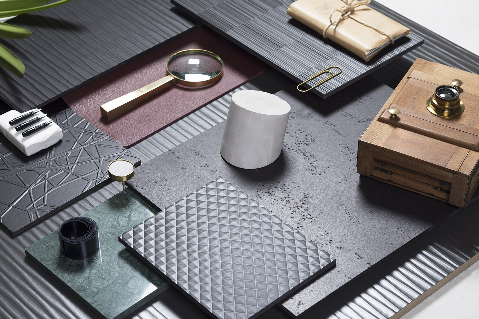
Rough surfaces, uneven finishes, deep textures. Interior design is turning away from homogenous surfaces and heading towards materials that stimulate our senses. Textured surfaces are here to stay.
Emotional design gives importance to senses which are usually ignored, and when it comes to touch, this trend towards the sensorial has brought about a surge in the use of detailed surfaces that eschew regularity and plays with volume, placing value on the tactile component of materials.
Textured surfaces to reconnect us with what is real
Another factor which has brought about the use of these types of materials is the digitalisation of our daily life. We look for textures to make up for the lack of physical contact in our day. As the Cuaderno de Tendencias del Hábitat 19/20 (The Habitat Trendbook 19/20) says, “textured and volumetric finishes are becoming more and more relevant, at the expense of polished effects and homogenous surfaces. We are looking for uneven textures that have a more natural look, even when they are not reproductions of real natural finishes.”
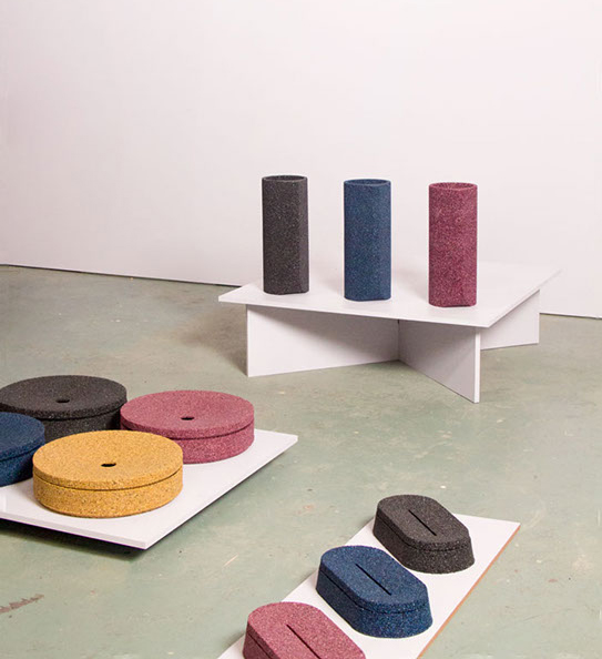
The Gravel collection by Tijs Gilde was born out of the reflections of the Dutch designer on how our current digital society is very connected with things that are not real, but we crave things that “reconnect” us human beings. It is a collection of decorative objects such as vases, boxes, and trays, as well as tables, made from a mix of stone, pigment, and a binding agent placed in a die casting. The result is an interesting surface that feels similar to gravel and which tries “to make even harsh materials suitable for interior purposes.”
The design mecca that is Milan Design Week confirmed this trend at its most recent edition with its exaltation of the qualities of materials. For example, there were more three-dimensional ceramic floor tiles which created volumetric designs.
Texture and colour in the new Fibracolour
“You must always try and take a step forward in projects and incorporate innovative materials that are alternatives to those that are normally used,” says Begoña Sanz Irbarren, member of Gobe Creativo. That’s how this Madrid studio came upon the new textured Fibracolour. With this ground-breaking spirit, they used it in the renovation of a central Madrid residence, a spectacular 400m2 flat with three different areas: one for the children, one for the adults, and a central area that functions as a meeting point. It has very bright, yet inviting, spaces with overlays and finishes to provide warmth.
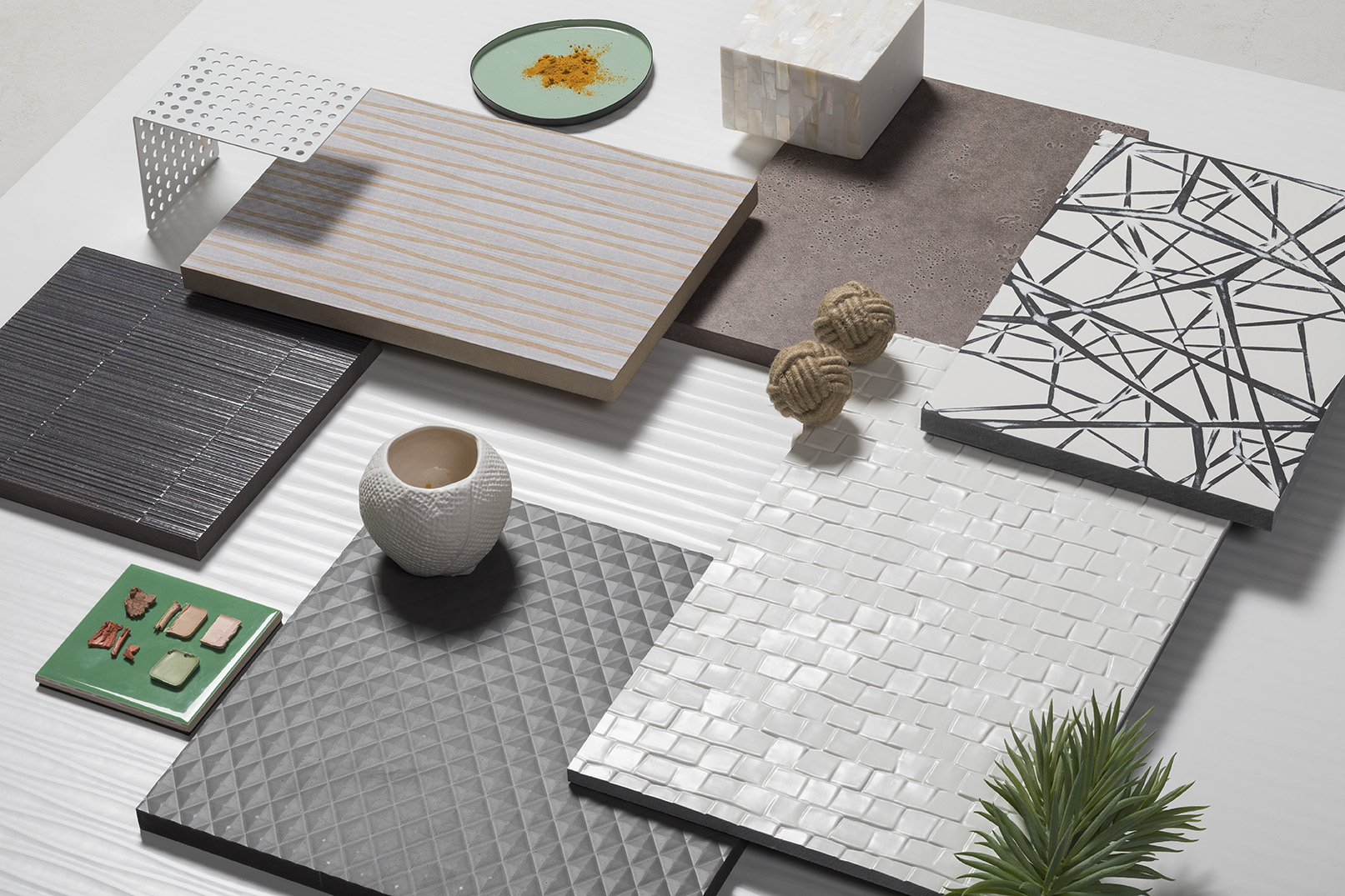
Gobe Creativo used this textured material to make the wall of the main bedroom that the bed rests against stand out. In order to make it the centre of attention, they drew on a combination of two different textures in their construction of the large personalized bedhead with integrated bedside tables. In the middle they used the Trama texture in black, with a motif that looks like a tapestry of branches. This was surrounded by the textured stripe of Fuji in grey tones.
It’s all about a new industrially manufactured material, but the references in the world of textures remind us of natural materials which already have texture, such as wood or stone. These used to be the only alternatives when it came to incorporating texture, and with them “you are very limited, for example, with colour. With these panels, the range is much greater, and it gives you the possibility of exploring colours and looks,” explains Begoña Sanz.
The importance of textured surfaces in interior design
“Together with colour, texture is what gives the most character to a room,” says designer Begoña Sanz, who points out that, thanks to materials innovation, the possibilities of incorporating them into interior design projects and “creating impressive designs” have increased.
The designer relates it to the emotional dimension of design: “Spaces have to speak to us, they have to produce sensations, they have to make you feel what the designer wanted you to experience. If you want to create an inviting space, everyone that enters your space must feel welcomed.” This dimension is essential when it comes to selecting materials because “materials talk”. If it’s always essential to be able to see materials up close and touch them, this is even more true in the case of textures, where it is important to see a large sample to give us a realistic impression of its effect or how the light hits it.
Textured surfaces have an influence on the visual weight of the design. The key is in the balance of the combinations, avoiding designs with a uniform texture. These materials create surfaces full of nuances and the inter-play of light and shade, which helps create focal points in a room. The right combination of surfaces with different textures and intense colours can also help to achieve a greater visual impact.
Tactile texture and visual texture
When we talk about textures, we think of the sense of touch. But there are also visual textures: smooth surfaces that create the illusion of texture through a design such as the repetition of a pattern. This is the case with wallpapers in geometric patterns. Thanks to new digital printing systems and new materials, there are now wallpapers which imitate the texture and colour of materials such as aged wood, cement, and bricks.
A good example is in the evolution of melamine boards, among which we found designs that realistically reproduce wood surfaces. A step further sees the incorporation of manufacturing processes of registered finishes, which match the grain of the drawing and add tactile texture to visual texture.
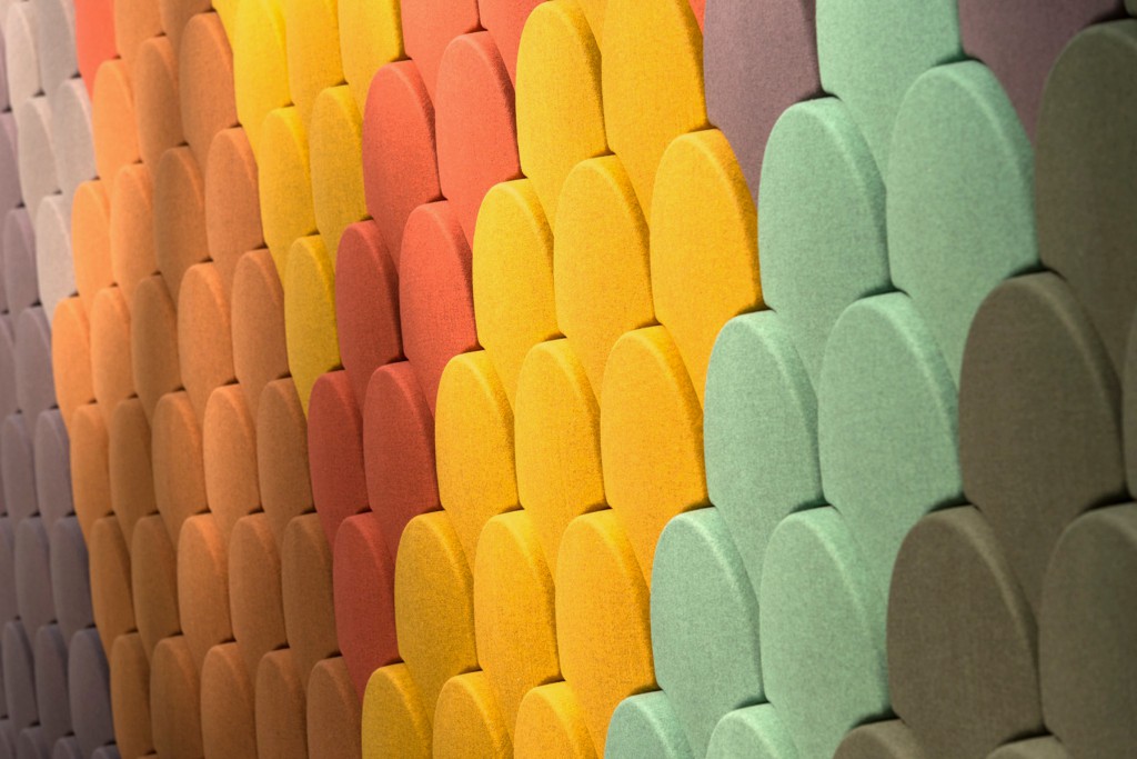
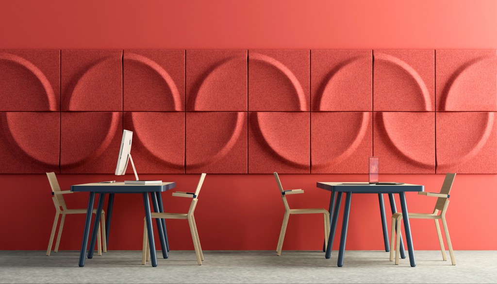
The latest innovation in this evolution is that of 3D wallpaper, which are in the form of modular tiles and that permit us to change the pattern depending on how we arrange them. Acoustic panels are another textured option for walls that have a decorative component which allows for different arrangements. These include Ginkgo, Gaia, and Arc, all by Stone Designs.
Gingko by Stone Designs. Photo: stone-dsgns.com / Gaia by Stone designs. Photo: stone-dsgns.com
Yes, the “popcorn” effect is also a textured surface…and it’s making a comeback!
In the 1960s, drops of paint filled the walls of Spanish homes. The “popcorn” effect created walls with a rough surface which had the advantage of hiding the imperfections of the construction of the time. Their natural successors were textured wallpapers that not only hid imperfections, but also provided a different touch to interior design, creating a two-dimensional and plastered effect.
After generations have tried to remove the “popcorn” effect from their walls, a new generation of interior designers are revaluating this decorative resource. They include Guille García-Hoz, who does not rule out using it to make a corner stand out, and Erico Navazo, who doesn’t use the “popcorn” effect in his projects, but rather striped pastes to create texture on the walls. “There are wall textures, which include the old version of combed or striped “popcorn”, that go very well with new decorative trends, where the vintage nature and practicality of more damaged walls go hand in hand,” explains La Casa Sueca studio, for whom “the reign of smooth paint is over”.
