Feria Hábitat Valencia 2024 showcased the state of the art in kitchens, materials, and home design. This edition brought together nearly 400 exhibitors from 17 countries across a 96,000 square meter space, spread over eight pavilions at the exhibition center.
The combination of Hábitat, Textilhogar, and Espacio Cocina SICI offered a comprehensive perspective on the latest trends in these sectors. Here are the most interesting insights we’ve gathered from Connections by Finsa.
The kitchen: the heart of the home
Espacio Cocina SICI, supported by the Spanish Association of Kitchen Furniture Manufacturers (AMC), demonstrated once again that the kitchen is a major catalyst for trends that will eventually permeate the rest of interior design. Indeed, it has become the focal point of the home, with a clear trend towards integrated home furnishing from the kitchen (including outdoor concepts) to maintain a cohesive aesthetic, emphasizing customization, particularly in curved designs and the extensive use of central islands.
Color plays a significant role, ranging from dark bluish-gray, greens, and terracottas to beige. We also noticed the use of lacquered metals for profiles and very neutral beige stones for countertops in a block or monochrome effect.
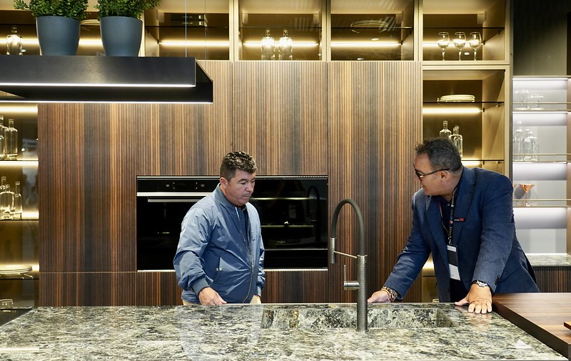
In terms of materials, veneer and solid wood are retained for fronts, even with deep finishes (such as Flute, Pirámide, or Calypso), while we see travertine and white marbles with very soft veins or limestone with veining (like this Creta Marfil). The finishes are mainly matte with a silky touch, with only a few notes of gloss. We were also impressed by the increasing popularity of anti-slip surfaces, extending beyond the kitchen.

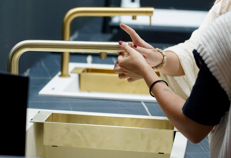
Technology is becoming increasingly present in the kitchen as well. Faucets that boil and filter water and appliances designed for efficient cooking were showcased, all under a design line that conceals rather than reveals.
Furniture and decoration trends at Hábitat Valencia 2024
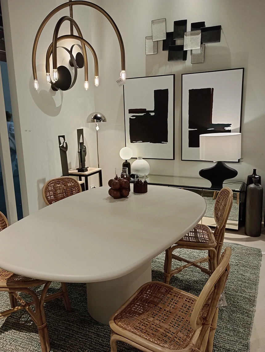
Feria Hábitat Valencia displayed a strong inclination towards warm minimalism, a trend that combines clean design with neutral and organic colors. This design line aims to create cozy and friendly spaces without sacrificing contemporary aesthetics. Another prominent theme we noted was integrated lighting in furniture, especially in wardrobes.
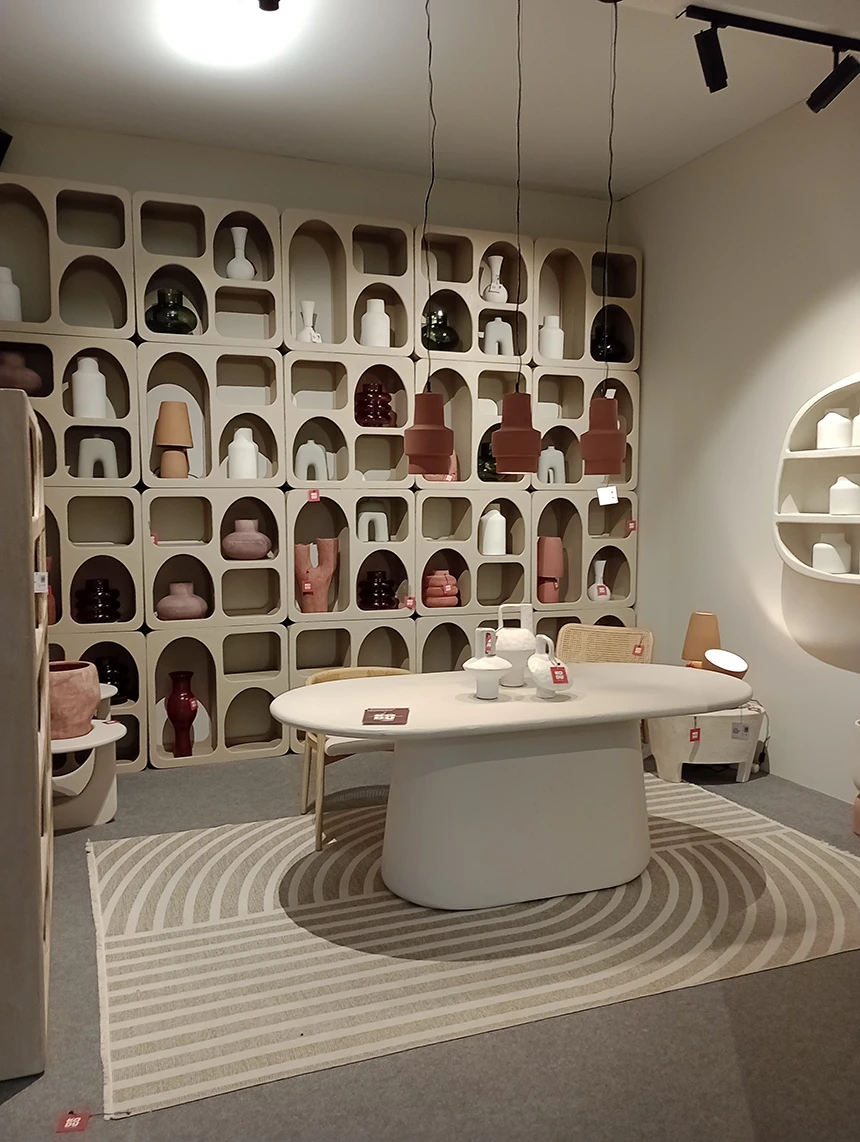
Natural and sustainable materials, such as jute, wool, whitish stones, or recycled fabrics, were prominent, as well as upholstered pieces. In terms of this product, we saw innovative applications in upholstered panels, especially in bed headboards, nightstand tops, or desks. Whitish stones or travertine, as an organic solution, also featured in the bodies of sideboards or TV furniture, aiming for a total look effect.
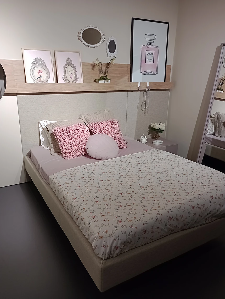
Colors gain volume within a composition. The most representative shades were reddish earth tones (rojo arcilla, terracota nova, rojo tassili), sometimes combined with makeup tones like this talc pink; along with pale yellows or greens like this. Color works everywhere in the home and is not used for zoning.

Fluting had less presence than in previous editions, although we did observe sparrow beak on MDF and very fine lacquer. We also highlighted rounded shapes, simulating a refined brutalism on all surfaces and planes, creating organic and primitive structures.
