The alarm was raised by TikTok. “The world is losing its color; it’s becoming more gray!” many users said. Their main source was a study by the Science Museum of London, which analyzed the color range of objects in its collection, spanning over two hundred years. The published text offers numerous graphs and explanations, but TikTok focused on one: 40% of the colors of objects analyzed in 2020 were gray and black; this percentage was only 8% in 1800.
A glance around us can confirm this trend towards gray and also the neutral, dubbed as “blanding“. Gray floors, the presence of bone color embraced, for example, by Zara Home, beiges, and earth tones… have we forgotten the rest of the shades?
Ver esta publicación en Instagram
The first clarification comes from the study itself. “While it seems that things have become somewhat grayer over time, we must remember that the photographs examined here are just a sample of the objects in the collection, and the collection itself is a non-random selection of objects”, they explain. In other words, the sample cannot be understood as a real representation of the world. The arrival of gray and black, on the other hand, is due to the change in materials: much less wood and fewer flourishes—which create shadows and a wider color range—more metal and smooth surfaces without variation. Industrial designer and CMF researcher Noemí Cortizas offers another clarification. “The study is from 2020. The lockdown has made things change“, she notes.
How did the taste for neutral tones arise?
That trend, that neutral blanding, existed at that time. It was mainly a thing for millennials and followed “the philosophy that if you have a very active life with many things, you want your home, your surroundings, to be something calm and that gives peace of mind”, Cortizas concedes.
Still, even though there were many whites or neutrals, they were never 100%: there was always a color accent, she points out. But COVID changed everything. “People were locked up. Having a hospital-like environment was no longer as attractive“, she explains. From there, a change began to be seen, not only in interiors. For example, she cites the fluorescent colors that filled fashion as soon as we went back out on the streets.
Ver esta publicación en Instagram
Colors are coming back… in different intensities
When designing, it is necessary to think about both the what (the space, product, etc.) and the brand for which it is designed, which will have its own aesthetics and codes, and the target audience, who we are addressing. In this sense, Noemí Cortizas sees a clear difference between millennials, who don’t dislike color but prefer what are called quiet colors (pastel tones, for example), and Generation Z. The latter, composed of people born between 1995 and 2009 approximately, are indeed asking for brighter and more vibrant colors. They are already the present of many markets and are also the future. Headlines that ten years ago talked incessantly about millennials now focus on zoomers or centennials, as Generation Z members are also known. Trends now focus on this latter group.
What does this younger generation like? Compared to millennial minimalism, zoomers prefer maximalism, which has little to do with the neutral world the study seemed to warn about.
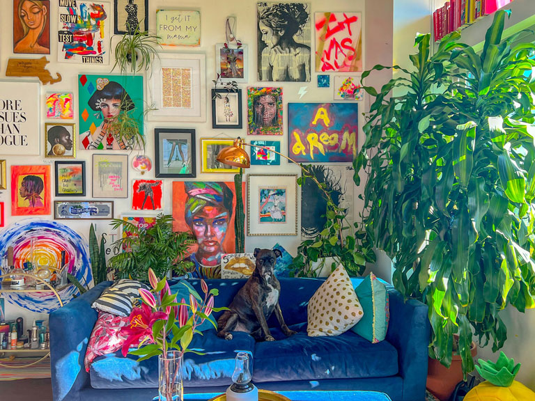
This trend, which someone not paying much attention may not yet see, is already clear to those in the design field. “Sometimes I have to create new pigments, which can take me a couple of years. I don’t design thinking about the present but the future”, says Cortizas. In that future, she sees color, more or less bright depending on the target audience. But certainly, a lot of color.
Sustainable colors to refresh us
The world of color is not oblivious to the climate crisis and the need to think about everything in terms of sustainability. Here those bright colors (the fluorescent ones of Barbie summer, for example) preferred by the zoomer generation lose some weight, but this doesn’t mean we are in that monochrome and neutral universe.
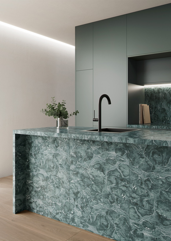
“As temperatures rise, what we try to do is make our environment give us freshness”, says Cortizas. That freshness is not provided by white alone, but rather accompanied by “a slightly pastel blue or a calm pink or orange”. Another example is earth tones with an aquamarine accent, “which provide that contrast and freshness”.
 Another sustainable point in favor of matte colors over bright ones is that they are more resistant. “They are compatible with a matte varnish, resist scratches, and, being not so bright, they are a bit calmer. They may not be fashionable, but they are elegant and attractive as time goes by”, adds the designer. By not becoming completely outdated all of a sudden, they last longer, which is key in sustainability.
A future of color
The future—as is not the present, in reality—will not be monochrome, gray, and neutral. There will be colors, which in some cases will be striking and in others calmer, but colors nonetheless. Zoomers may not be buying houses yet, but many are already decorating their first homes outside the family home. What is seen there is a preference for replicas of design objects from the sixties and seventies, decades characterized by vibrant colors. An example (though there are many) is the Nessino lamps by Artemide.
Ver esta publicación en Instagram
On the other hand, trends for 2024 already spoke of an explosion of color in spaces like the kitchen.
 Neutrals, pastels, and bright colors will coexist, and saying that only the latter count as colors is simplistic, says Noemí Cortizas. “You can have color without it being very flashy”, she argues. And she predicts about the coming years: “A blast of color is coming“.