In our Connection with… interview this week, we will be entering the creative universe of Cenlitrosmetrocadrado. As an introduction to their work, we wanted to show you some of their projects from different domains, ranging from product design, spatial design, graphic design and their own I+D+Cen (R+D) department, which they use to explore the possibilities of design.
1. Nado, spatial design
Iván Domínguez’s new restaurant reflects the essence of the Atlantic through its colour palette. The staff receive clients in the kitchen before taking them through to the dining room, which features two large banquet tables with surfaces that can be divided into different parts to adapt to the size of each group.
https://www.instagram.com/p/Bv18feKHzWr/?utm_source=ig_web_copy_link
2. Ferrádica, product design
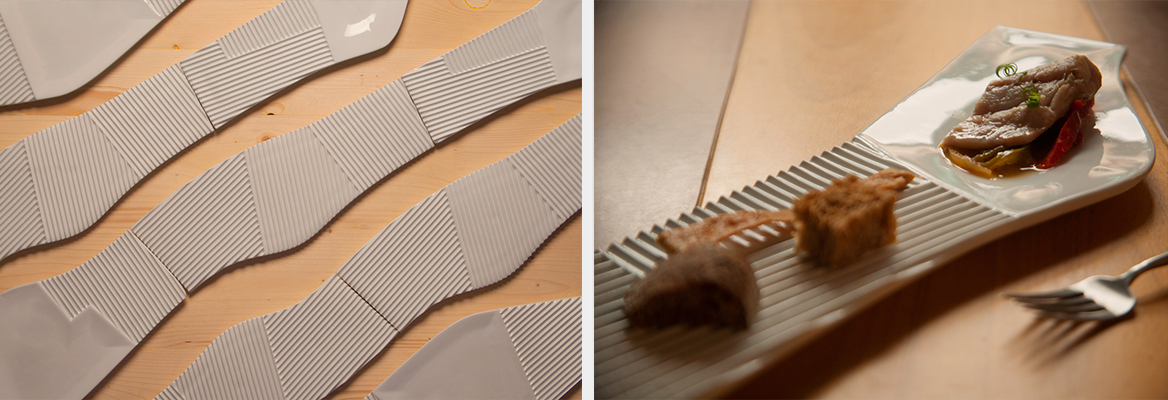
The plates from this set of dishes, developed in collaboration with Sargadelos, is based on microplots, with three different textures (ploughed, flat, and concave) that adapt to any presentation. Thanks to their design, they now form part of the permanent collection at Barcelona’s Museu del Disenny.
3. Exenta, furniture design
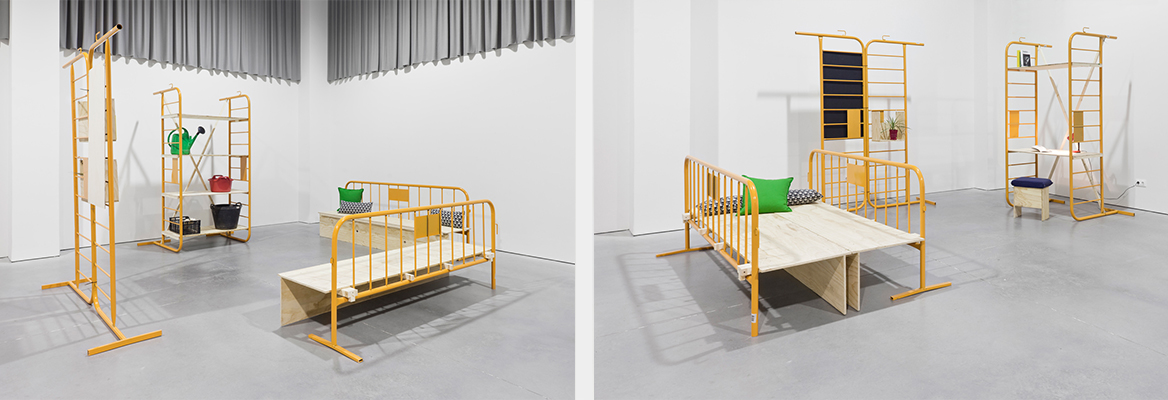
This family of multi-purpose pieces of furniture was designed to meet every possible need, both domestic and professional, of an artist’s residency. They include a dining table and desk, a bed that transforms into a sofa, a bookshelf that can also be used for kitchen storage, and a piece that can be used as both a kitchen table and dressing table.
https://www.instagram.com/p/BzycUSRHaDj/?utm_source=ig_web_copy_link
4. Almáciga,workshop
Inspired by construction fences, this “neighbourhood management kit” is a simple and flexible system designed to respond to the common needs of a neighbourhood, from meetings to an afternoon snack outside.
5. Dando la lata, I+D+Cen
In 2007, not long after the studio was founded, they decided to make innovation their defining feature with this project: a can that contains seeds and vegetable substrate that allows us to create a tiny garden in our office.
https://www.instagram.com/p/BypghQEnxDy/?utm_source=ig_web_copy_link
6. Finfloor’s 20th anniversary, exhibition design
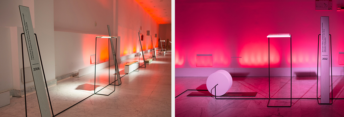
The objective of this display was to visualise the process of the birth and evolution that Finfloor experienced over twenty years. It was symbolised by a timeline created using a long metal profile on which the brand’s milestones were indicated by a change in the timeline.
7. Arquitectos de Santiago, graphic design
The layout of Santiago de Compostela’s old town was turned into a crocheted mat in an image created for an exhibition that Santiago’s architects used to invite the public to their headquarters.
https://www.instagram.com/p/B2WENgln7On/?utm_source=ig_web_copy_link
8. Lesma, packaging design
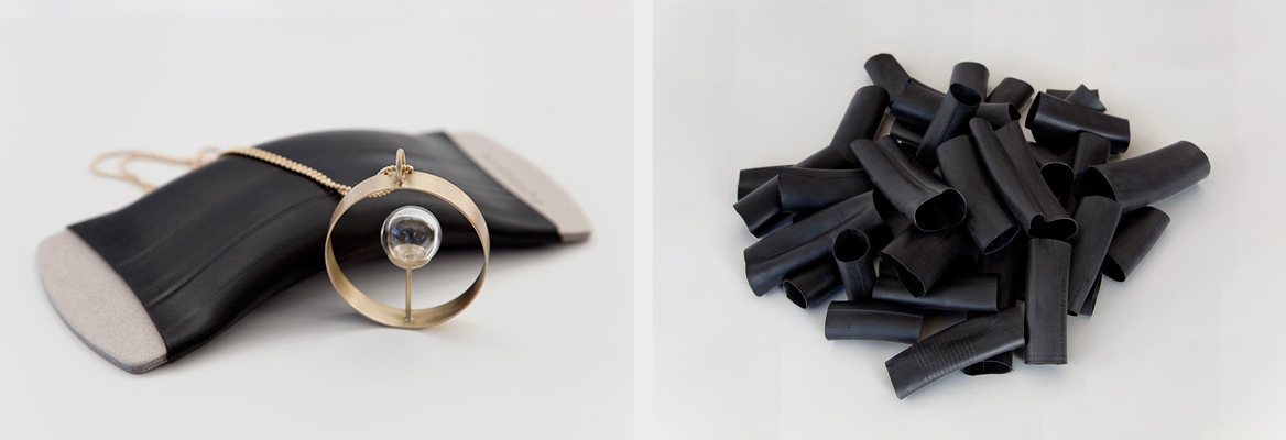
“We really like reusing and decontextualizing objects and giving them a second, dignified life,” says Xabi. One example is this packaging created for products by jeweller Rosa Méndez, which is made from the inner tubes of bike and motorcycle tyres, in line with the philosophy of integrity when using materials followed by Méndez herself.
