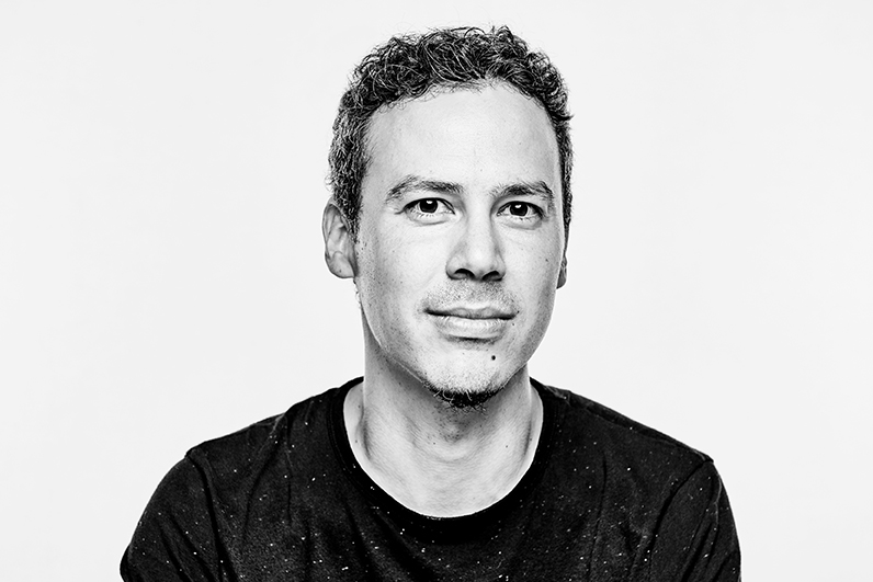
Ben Castro is the senior art director for the adidas Originals Brand Design department, where he is in charge of the look and feel of the brand, or rather taking care of how the brand is perceived and what is communicated in its campaigns, points of sale, retail, events, and more. The path that has led him here has passed through many different stages connected to design, from architecture to retail, and from art to product design. But let’s let him tell us about it himself.
How did you come to be the art director for adidas Originals?
Adidas is such a big company and it has so many functions that, once you’re inside, you become conscious of the complexity and the quantity of designers and creatives that are a part of it. Getting here was part of a natural process of advancement and evolution in the work that I do, and it’s related to my curiosity and my desire to discover new things in the world of design. I studied architecture and I started my working life in architecture studios. Later I set up my own artistic collective, where I was curating and doing art projects. I have worked as a product designer, a retail designer, and now I’m more focused on creative and art direction. They are all different areas related to design which have taken me down this path.
I like to see design as a very broad discipline that can be approached in many different ways and what I’m doing now is just another one of those facets which allows me to discover new angles of design.
Which part of your job do you most enjoy and why?
The whole design journey is exciting, but the two parts that I’m hooked on are coming up with the ideas and the materialisation of the ideas. The first is about confronting the blank page, starting to conceptualise and look for ideas, references, explaining the project. It is a phase that mixes strategies, dreams, trying to look for new solutions, looking at what has been down before in the same area etc.
The other phase that I really like is when you bring it back down to earth and you have to fill in the details and make decisions: colour, texture, shape… When it materialises and you give it its final dimensions. You’re really putting everything on the line in this phase because, regardless of how good an idea might be, if you don’t execute it well, the project doesn’t work. The ideas phase wouldn’t make sense without the other details phase.
When were you bitten by the design bug? What were your beginnings like?
I think it’s something that is part of my brain, because I have always been very curious about how things are made and how an object or a space is created. When I was little, I was already making things – my own furniture, my own toys – and I immersed myself in what I saw around me in an intuitive way.
When I started to understand what design involved, I decided on the direction I wanted to take. I was really interested in products, graphic design, and visual communication, but I opted for architecture because, because I see design as something very broad, architecture involved more disciplines. But I always knew that I had an interest in design at every level and on every scale.
Now I’m designing my own house and returning to my architectural roots. It is a fascinating journey that I’m really enjoying, getting back to designing details, thinking about construction systems…having experienced different disciplines and my current way of looking at design means getting back to architecture is full of new nuances and new focuses that enrich the process.
You started your own artistic collective at the Escuela de Arquitectura. How was Basurama formed and what did it mean for you?
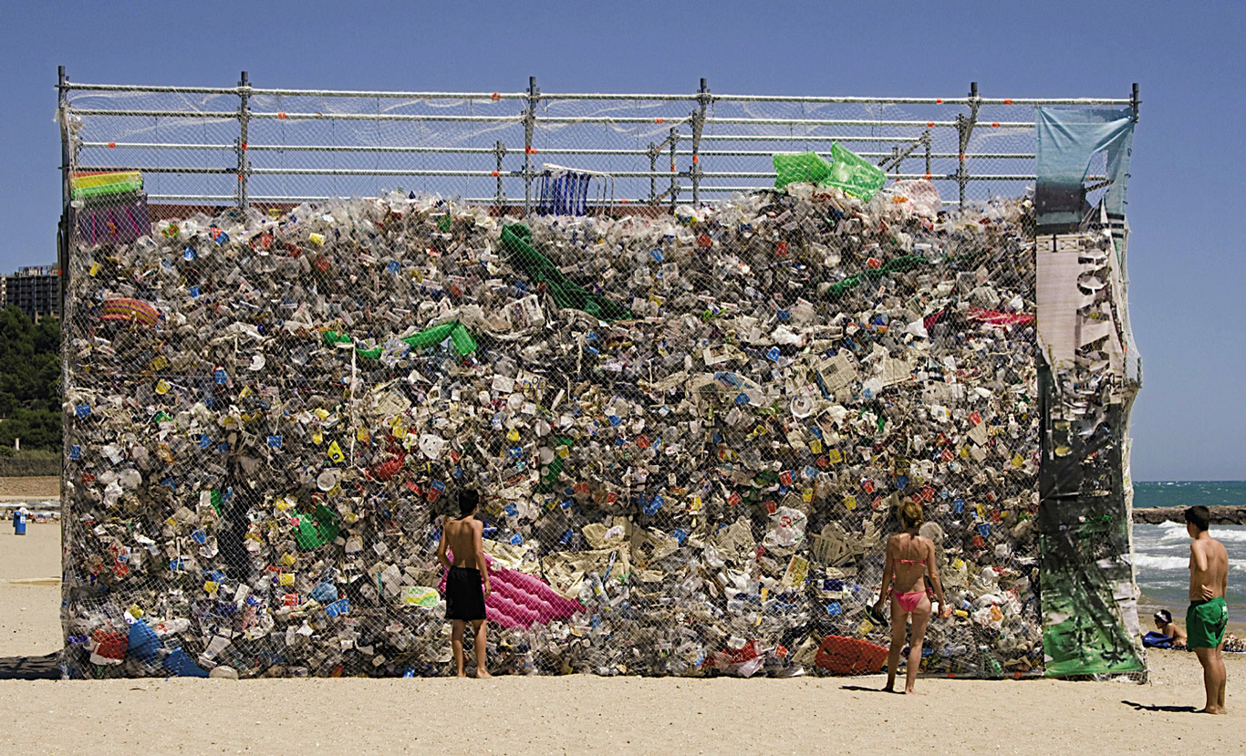
Basurama came about in an intuitive way as a reaction to a course I did that had a very strong theoretical focus but within the frame of the architectural practice, which requires contact with something real. A group of friends and I shared that restlessness for diving in and we decided to set up a parallel creative space and use it to experiment with materials and see how we could construct spaces, objects, or furniture in an ephemeral way. Since we didn’t have a lot of resources, the idea of using waste came up and we discovered that not only was it not a limitation but that rubbish opened up a world of infinite possibilities when it came to materials, shapes…It was a more varied world compared to traditional architectural materials and, since we didn’t have resources, it was a mechanism that allowed us to access raw materials immediately and put our ideas into practice. It ended up being an enormous creative catalyst.
I’m still in contact with them and I play an honorary role but I’m no longer involved in its day-to-day running.
How did you get involved in retail design?
I was always very interested in temporary spaces, temporary structures, exhibitions…At a certain moment the opportunity to start working for companies that designed shops came up and I discovered that it was the perfect platform for experimentation, because construction times are much shorter and required a greater reaction capacity and speed when it came to trying ideas and creating spaces. From then on, I focused on commercial spaces and for many years it was my main job.
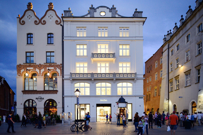
While designing retail spaces for Zara, you experienced the revolution that resulted from the eruption of online retail. Do you think retail knew how to deal with it?
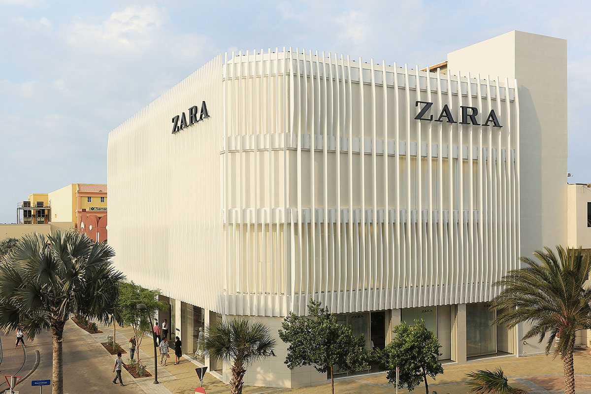
I think that question is still pending for retail. At Zara ,we did it with a few key ideas and we introduced some revolutionary elements which were ahead of what was being done at the time, taking advantage of the opportunity to create synergy between the digital platform and the physical point of sale. But the scene evolved very rapidly, and we are still in a transition phase. There is still a lot of potential yet to be discovered and to be introduced in the design of commercial spaces. There are some interesting ideas, but they still haven’t reached maturity and brands need to have a more adventurous focus.
For example, when I was part of the Zara architecture studio, we began an analysis of how to generate synergy between online sales and the physical store. We wondered if we could create a physical space that would not have products for sale but rather would be a showroom that worked like a catalogue, that people would use as a space to have a direct experience with the product, which is the difference between the store and the digital space, but the sale would be made online. This project was introduced on several occasions as a temporary space which served to maintain an active point of sale during a renovation. I think there is potential to introduce it in a permanent way and it could be an opportunity for generating a type of more immersive brand experience to build loyalty among clients and communicate the brand’s values.
Has the arrival of online shopping made the design of commercial spaces more relevant?
I think the physical space is more valued now as well as the need to create something which has an impact on the consumer and conveys a message. Before, retail was practically the only channel for this and there were commercial spaces that were not well thought-out from a design perspective. Now, when a brand opens a physical point of sale even though they have an alternative which would require a smaller investment, they are more conscious of the need to provide added value. This means that the general quality of design of points of sale has increased. It’s also true that large-scale demand has decreased, and the trend is to open fewer stores, but to make them premium stores that are more specialised and of a higher quality.
What is the key to a good design?
Right now, a good design for me has to be able to convey emotion and not leave you indifferent, to have an impact and shake things up a bit. The fact that there are people that reject it as well as people that like it a lot is a symptom of having a good design behind it. It also has to fulfil the function that it was conceived for perfectly. If not, it’s not a good design, despite the impact it might have. A third characteristic would be that it’s easy to carry out with simple and cheap production materials. This depends on the context, because there is also more exclusive design which requires a larger financial investment but that is also good design.
Ten years ago, I would have given you another answer and in ten years’ time I will probably give you different one. Design is something that never wears out and my experience means my answer is always changing.
What are the qualities that a good designer should have?
A lot of curiosity and being very demanding of oneself in order to achieve excellence, avoiding the easy route and looking for alternative solutions, perseverance to repeat and search until you have a design that has something that makes it unique.
Where does inspiration come from? Do you have a certain ritual or do you consult a certain publication that is like a bible for you?
In my case, inspiration comes from shaking up ideas and that happens when there is a heterogenous group working on a project with different interests, points of view, and inspirations. In the end, inspiration comes from everywhere and the more diverse the team is and the more open the focus is, the more possibilities there are for interesting ideas to arise. Debate, questioning ideas, and not expecting things to be a given also help.
If you hadn’t become a designer, what do you think you would be doing now?
I never imagined not being linked to creation and design because it has always been part of my daily life.
Which creators are your design inspiration?
There are many great designers and creators that are very inspirational for me. I have lots of inspirations, but there are always some that never change. Lina Bo Bardi is an architect whose body of work has a great impact and exuberance due to a transgression from the status quo and the rules which is very inspiring for me. In the graphic design field, I’d highlight David Carson, another designer that breaks moulds and creates a discourse that is very unique and personal. But there are hundreds: the Eames, Alejandro de la Sota, Souto de Moura…
Which architectural or design professional would you like to connect with/collaborate with?
In my work I am lucky enough to have worked with and to continue to work with people that I admire and that I have dreamed of working with. I feel very fortunate because I have already achieved some of the dreams on my list, like working with Denise Scott Brown, who I invited to work on a Basurama project, and working with David Carson at a workshop organised by the Luis Seoane foundation in A Coruña.


