Design trends in offices and workspaces have evolved from “workspitality” to full “homification” and domestication. We will analyze this concept through three workplace projects of different typologies, highlighting their interior design keys.
Celebrating curves: Switch Simon headquarters
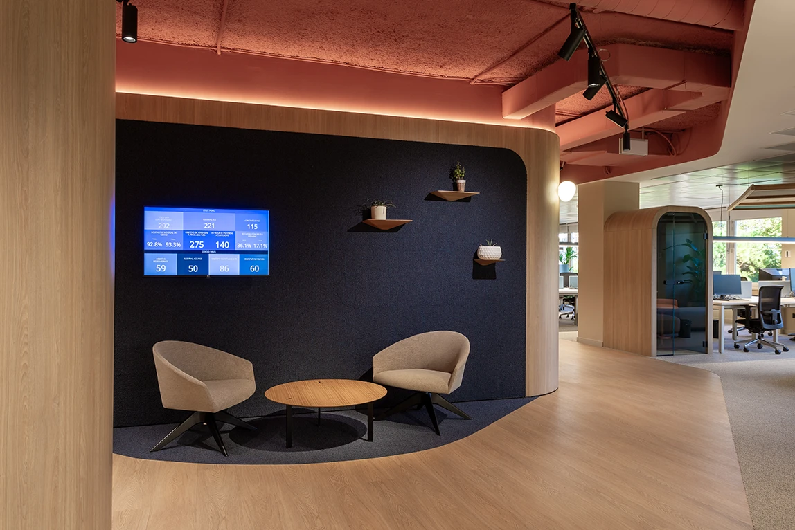
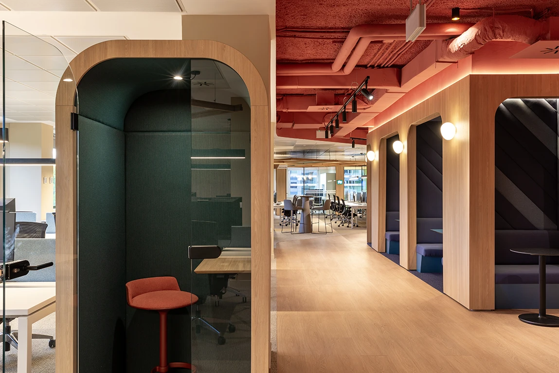
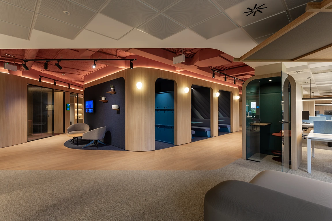
The new Switch Simon headquarters, inaugurated in 2023, was remodeled from the company’s mid-20th-century factory. “This project’s constraints led us to embrace curved surfaces as a counterpoint to the rationalism of the pre-existing building, where rectilinear shapes predominated”, explains Rubén Ortiz of Katty Schiebeck Studio, responsible for part of the interior design. A retro-futuristic character prevails throughout the space, shaped by HPL as a covering for these curved surfaces that serve as a leitmotif throughout the interior.
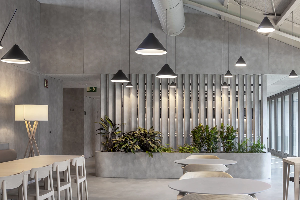
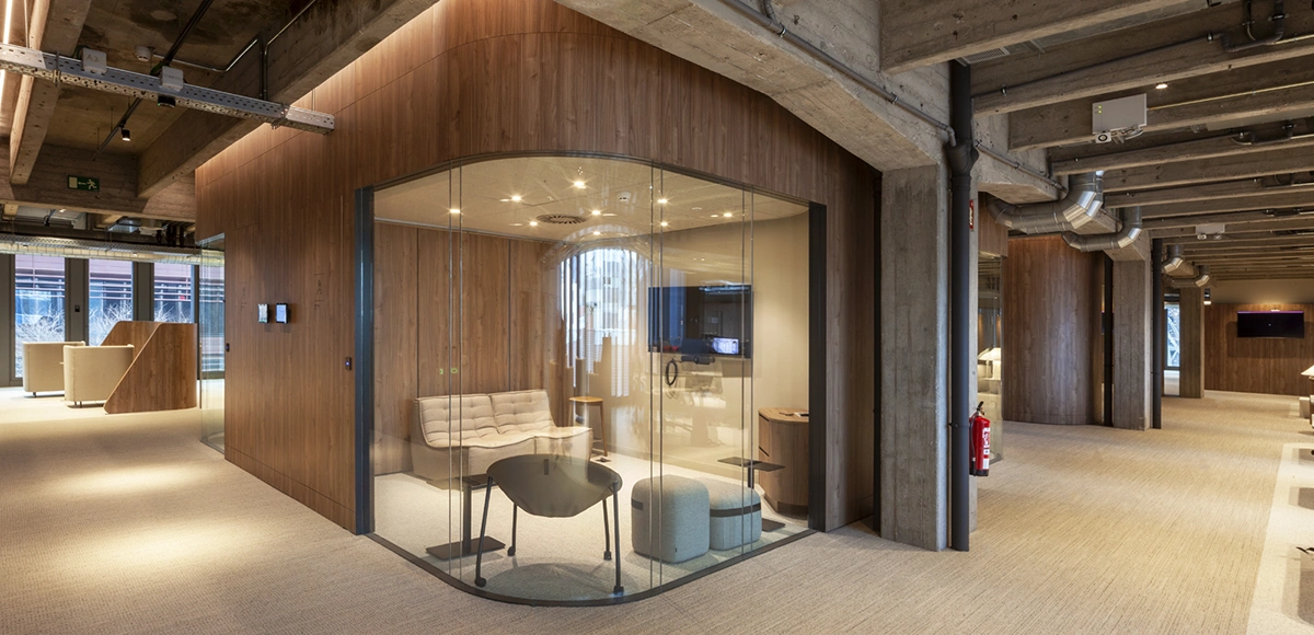
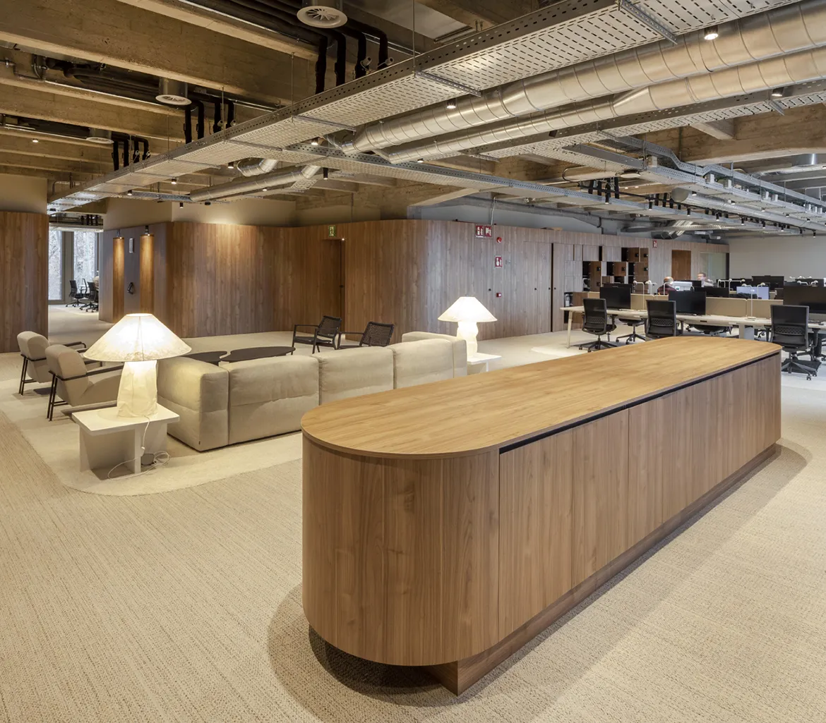
“A workspace should be, above all, a place where people can work comfortably, but it should also be a representative space that reflects and conveys the company’s values”, notes b720 Fermín Vázquez Arquitectos, the firm responsible for the architecture.
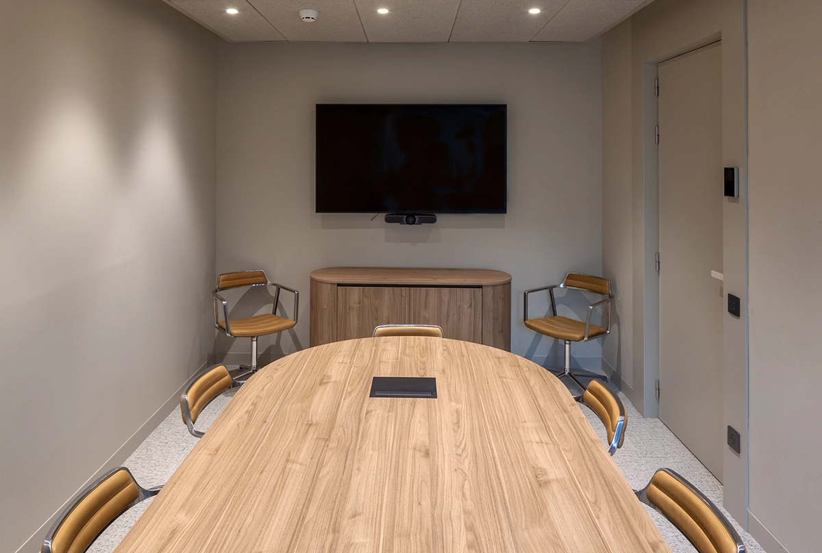
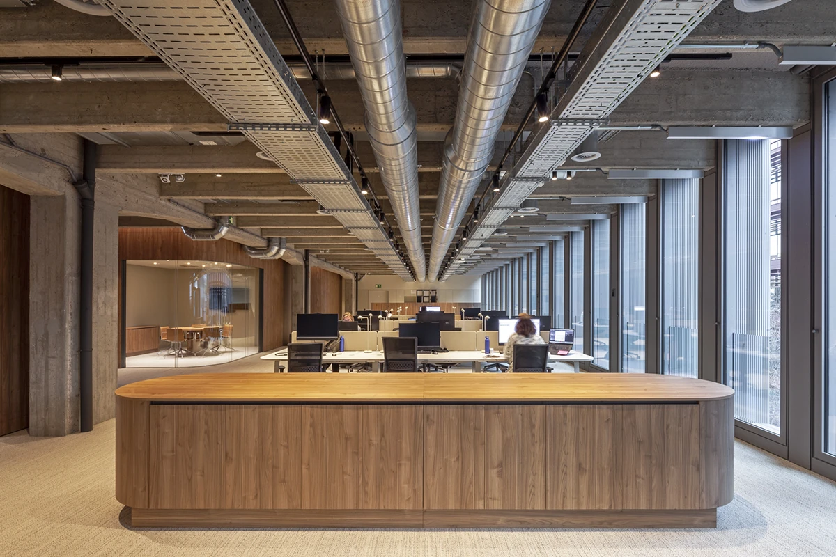
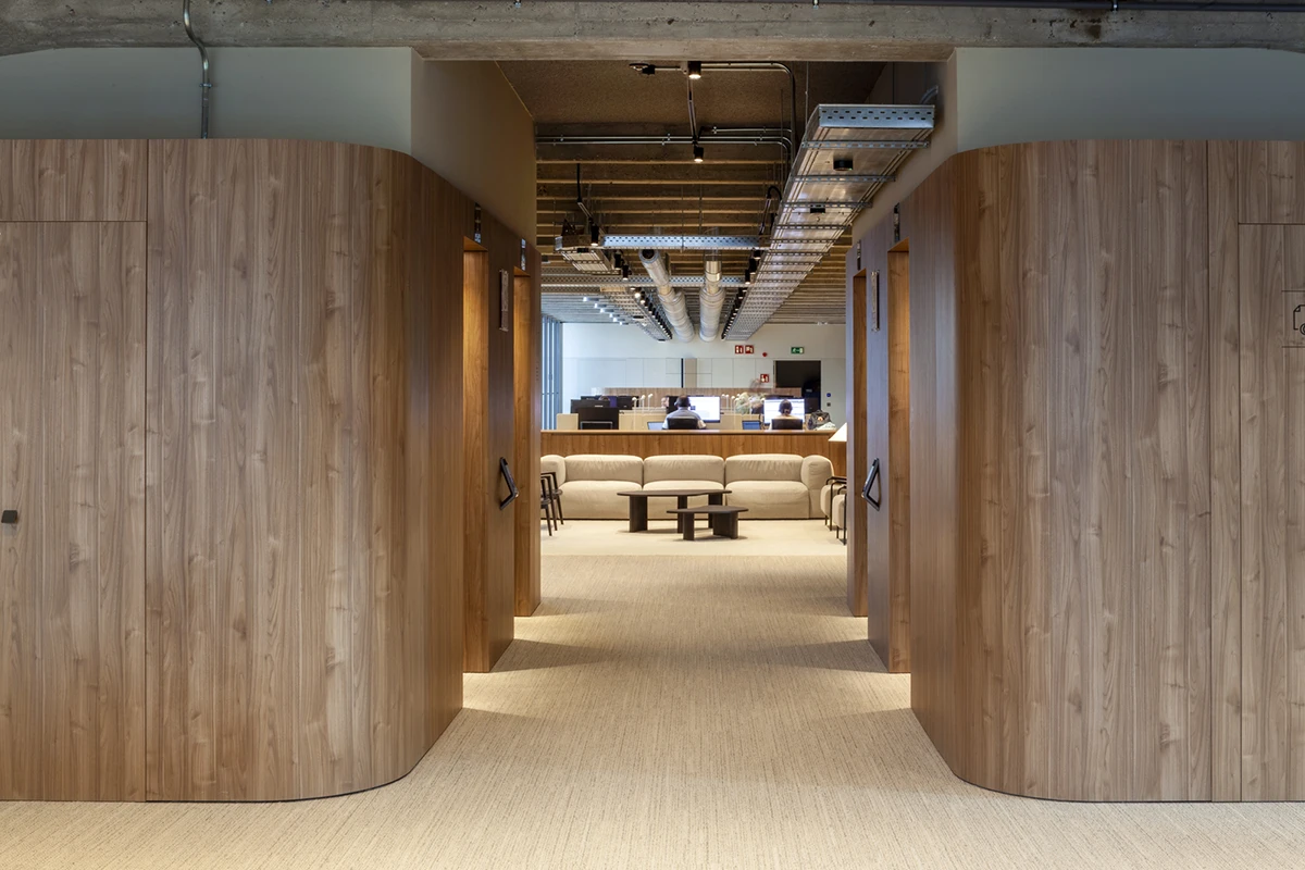
The project holds LEED Platinum voluntary certification, which b720 Fermín Vázquez Arquitectos values as “a very useful tool for achieving the objective parameters often related to issues still pending regulatory oversight. The intervention in the Simon headquarters aims to go further, introducing measures not directly included in the certification, such as the conservation and updating of an existing building as a key sustainability measure that reduces waste and the use of new materials”, the firm emphasizes.
Blurring the lines of on-site work: Testa HQ
Testa’s headquarters are the perfect example of balancing in-person and remote work. “We wanted to create an environment that could evoke the feeling of sharing moments with friends at a dining table”, states Stone Designs.
This concept is evident in a warm, welcoming, and natural space that enables the coexistence of in-person and remote work modes through collaborative spaces. In this way, “the transition between home and office becomes fluid and organic, with the office functioning as a gathering place to enrich group experiences”, concludes the studio.
Like an open book: Anaya headquarters in Madrid
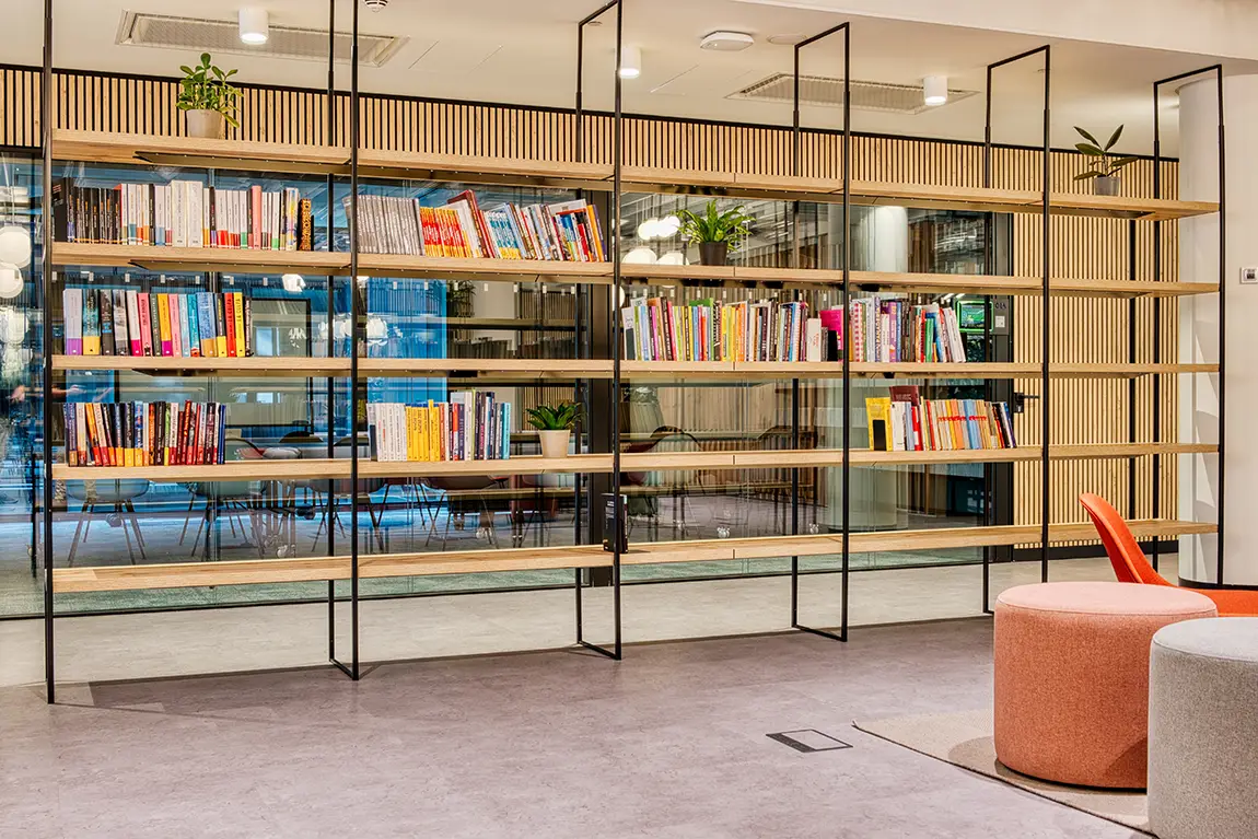
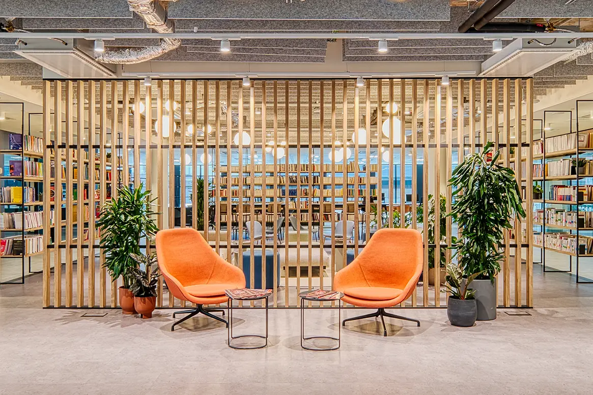
It would be impossible for a publishing house’s headquarters to lack books. Anaya’s headquarters in Madrid takes inspiration from books and bookshelves as central elements. “This personalization seeks to reflect the company’s identity and strengthen the sense of belonging”, highlight Carlos Manzano Arquitectos.
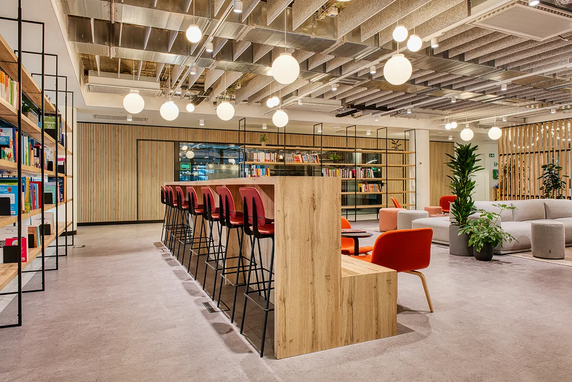
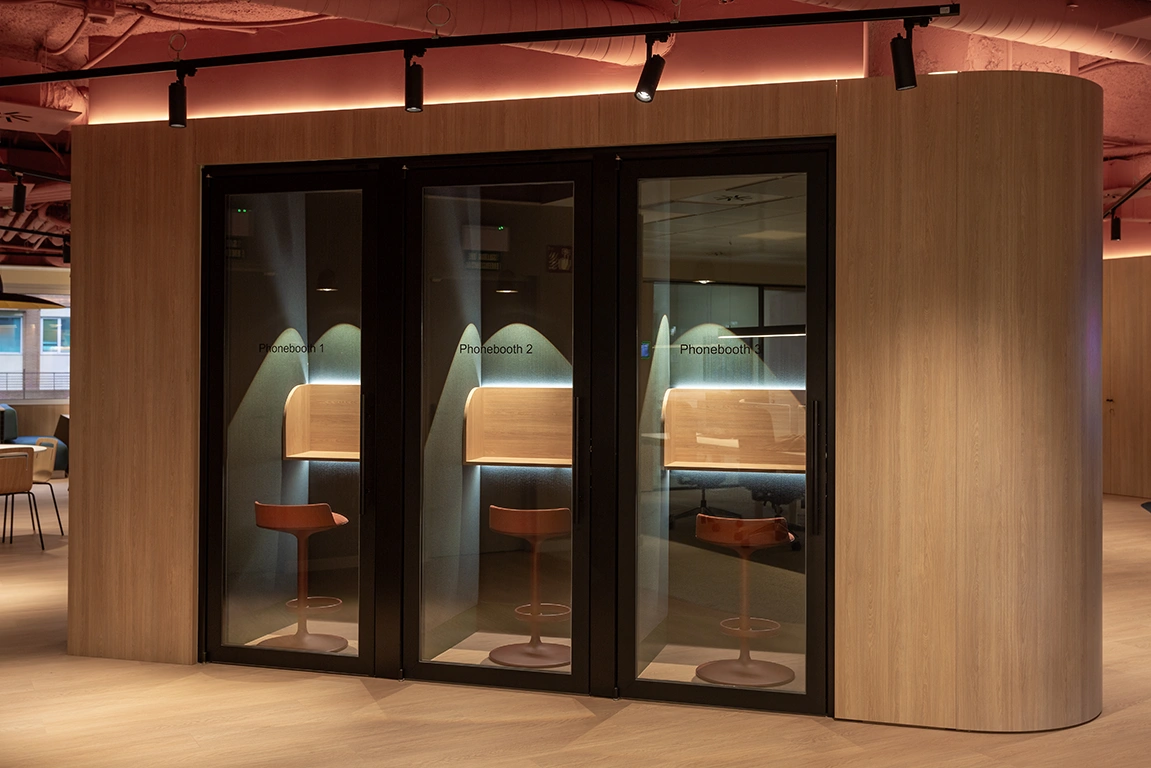
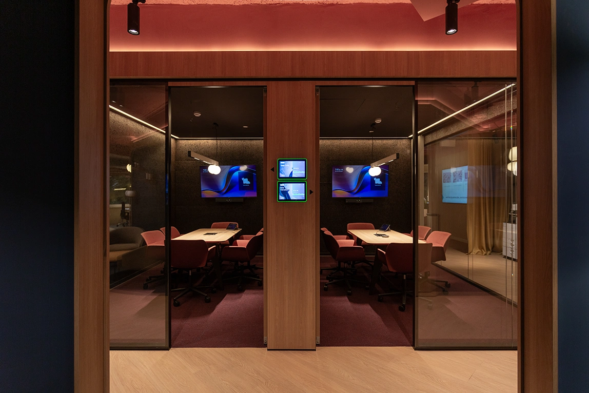
Here, it is clear that the open-plan layout has disappeared, replaced by an office with a greater diversity of spaces based on the concept of activity-based working, where each task has its associated area: rooms for video calls without causing disruptions or areas with a high table for informal meetings among small groups.


