“Casa Decor is a miracle product of the huge professionality of the people working there”, tells us Izaskun Chinchilla. We talked to her about the design she realized for the auditorium of Casa Decor 2017 and about architecture in Spain.
Izaskun Chinchilla is an atypical architect. In her early 40s, she resigned and now she manages her own studio. She bet on her ideas and now encourages her students to do so, as a professor in several Spanish and International Universities. Time flies talking to her and it is impossible not to be influenced by her passion for architecture… and for the human being.
Izaskun Chinchilla in Casa Decor
- The Auditorium is maybe one of the most colorful spaces of Casa Decor. Is this presence of color an identity mark of your studio?
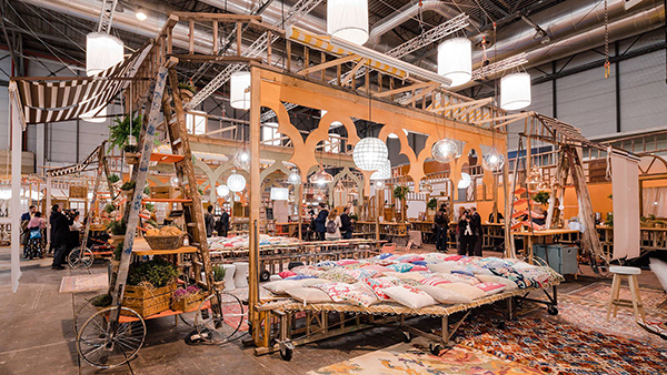
- We have a color policy which is a distinguishing feature, not for style, but because, as our experience taught us, we believe it works. We have done a lot of research on aspects of color and, just as there is fondness of natural materials, we try to set the color as it appears in the landscape. We use little saturated colors and a varied palette. At Casa Decor the colors are soft but there are many nuances, like in the big photos of landscapes.
We do a fragmented processing of color, with intermediate colors, playing with light and shadows, without big surfaces of plain color, kind of like when you are in the wood – where the ground is splashed with points of light and color changes. According to psychologists of perception, this generates a sense of calm and welfare linked to natural spaces. We have been working for more than 10 years and in any project, we keep on learning, especially by things people tell us about what a good companion of life color is, that allows them to work more focused or to find pleasure in being home.
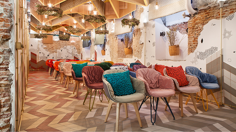
Izaskun Chinchilla designed a cheerful auditorium full of color for Casa Decor.
- Where did the idea of being inspired by the paintings of Fortuny originate from?
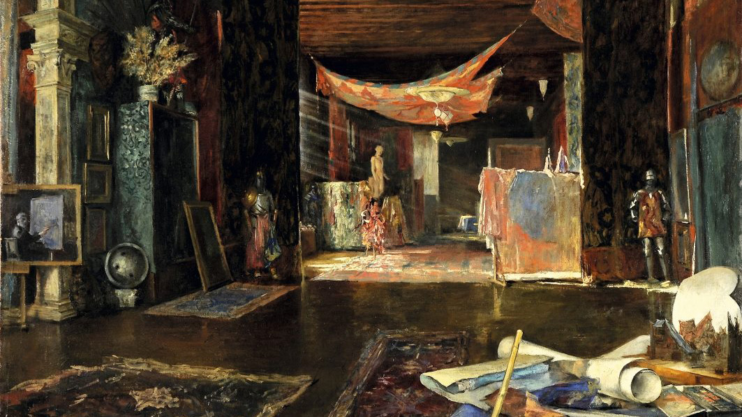
We try to make sure that our projects are always contextualized. At the top of the space we wanted to pay a tribute to the neighborhood of the Jerónimos, so we went to the Museum of Prado to see the paintings of the time when the Casa Decor building was built. We were really inspired by Fortuny because he has a series of paintings of the Alhambra in ruins, covered in vegetation, he portrays with an incredible beauty and a very romantic power of incantation. In European cities we have a lot of buildings in bad shape we have to restore, but if instead of making everything new we could transfer this sense of beauty, we would also be in line with ecology and sustainability, very contemporary values.
We occupied the old gatehouse and sometimes we have the feeling that in order to create a space once humble we have to spend a lot, using fancy materials. We wanted to almost literally bring stuff from the paintings: the chips, that let us see part of the gypsum and the brick, the use of plant species… From our point of view, this philosophy of the ruins with a touch of austerity generates more beauty and romanticism than expensive cars. And we always work thinking that there are more small pockets than big pockets and that everyone has the same right to beauty.
- This commitment on austerity made the assembly easier or harder?
What you see in Casa Decor is a miracle product of the huge professionality of the people who work there in every field. It would not have worked if it wasn’t for the brands that really know their products. They explain it to you and they advise you on what you are going to get, because there is an amazing organization, because they are the best interior designers of Spain….
Our project did not make it easier or harder. Spaces containing a very fancy material and a high cost of realization are very hard to produce. And producing a very nice site, beautiful, technically correct, well designed, with few money, is also very complicated. You simply work with a different palette of materials. Among other things, due to an environmental commitment, we try to work with a certain austerity of means. However, we are a studio much more decorative, with much more texture, than studios more austere in their image but that use finer materials. We try to produce a result more imaginative, with more imagination and we want the resources to be simple as for manufacturing, cost and environmental impact – we use a lot of recycled.
- Which other spaces of Casa Decor do you feel in tune with?
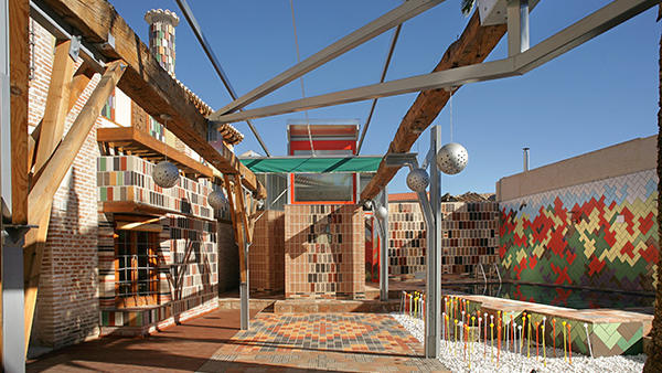
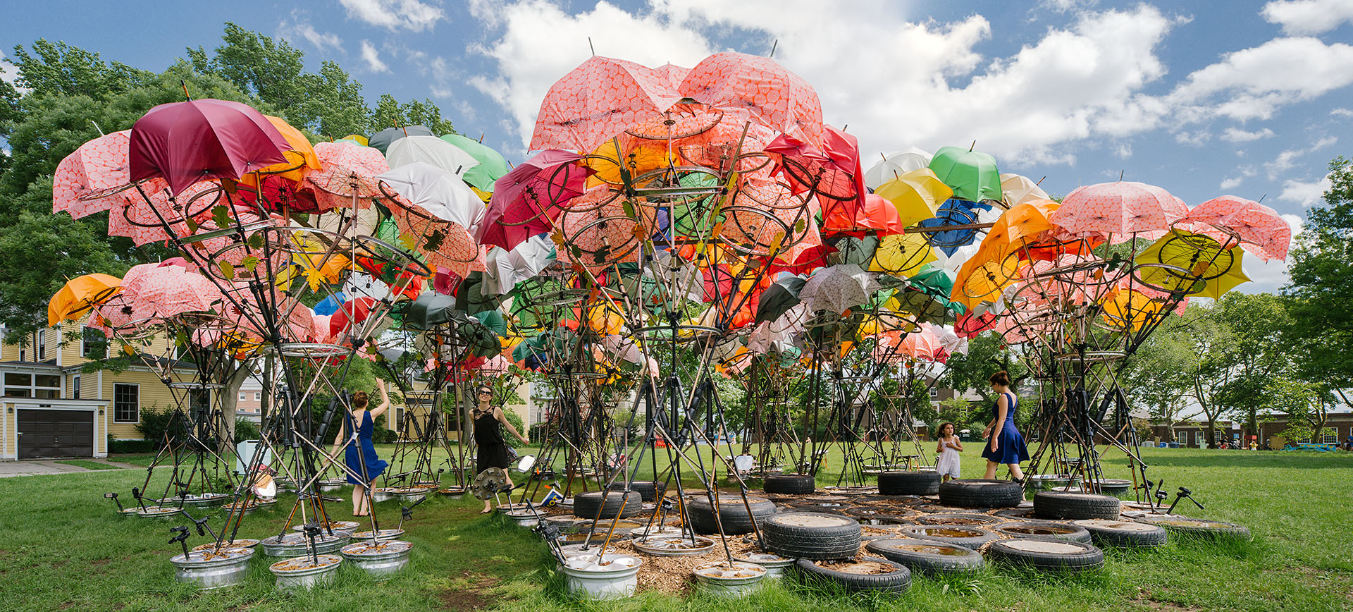
There are many spaces we loved and with whom we feel identified by concrete elements, although nobody carries out the conjunction of elements we do. For instance, we liked the paint works of stairs for the simplicity of means and the visual effect and the imagination they achieve. The giant umbrella of the deck has much to do with things we do, related with the recovery of the Mediterranean tradition and the public space. The space of Guillermo García-Hoz has all this experience and celebration of color that is very close to us. We also feel very close to the will of creating a kind of landscape in vegetal spaces, working as if they were greenhouses, with wooden half-timbered on the walls, or floral wallpapers. There are spaces with a childish and a playful touch that we also like a lot. There are many things we work with that are trends shared among designers, because they are logical answers to recurring situations.
The importance of materials
- In your space there are mostly textile and wood. As an architect, what are these materials worth to you?
Materials are the first perceptive approach of the user to a space and, on a technical level, they determine what a space needs in terms of the structural, acoustic, completion, isolation or illumination conditions. To us textiles and wood have a major relevance than to other architects turning into a distinctive element for the biophilia. Human beings have a natural tendency to feel well when surrounded by materials such as wood, as it comes from a living thing.
There are people to whom projects manufactured in metal or glass feel cold, but I don’t know anyone who doesn’t like wood. We instinctively feel pleasure and a certain calm when we have this material around. The textile also is associated to warmth, to protection. Both are materials with a very important anthropologic and cultural history, used practically in every age of history by every population. Also, they have very interesting technical characteristics: mechanical, of acoustic absorption, of thermal insulation…
- During the design, you paid a lot of attention to the acoustic aspect. Is it linked to the fact that it is an auditorium?
Acoustic is not just linked to auditoria. According to a study, 85% of restaurants and 80% of working places in Spain do not meet the minimum acoustic conditions. An acoustic study and adjustments are necessary in spaces where situations of multiple source of sound are produced, with several people talking at the same time, and you have a privacy need. We worry about this aspect when we design schools, offices, meeting rooms or restaurants.
In an auditorium the acoustic treatment is more complicated, you have a dual objective. The first one is to absorb all the sound waves that have nothing to do with the original source issuing the sound. In material such as glass, steel or stone, the rebounds multiply and intersect. The second one is to generate a sense of acoustic privacy. Now, it is usual to find these types of open plants and it is a challenge: we need someone to be able to have a conversation without bothering another person.
- How did you get this acoustic comfort?
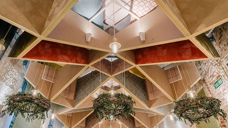
For the Casa Decor ceiling, we designed a type of small cells with Finsa panels of particles that, due to their geometry, make the sound bounce off the walls of the cells and reduce the sound waves. It is a solution not very different from the ones that have been seen in churches throughout history. The porous nature of the panels, less dense than wood, allows the waves to be absorbed, starting from the second order. There is a specific material, called Absortec, we used in partial elements.
This subdivision of space in smaller spaces, like niches, also increases the sense of acoustic privacy. Speaking under one of these small cells, the sound tends to remain arrested and the audience that was there appreciated the effect: you can have a conversation with a regular voice volume and, while the person next to you can hear you clearly, you do not hear people in the background. The comfort of these effects has no price.
Wellbeing vs. aesthetic of the interior design
- Is wellbeing incompatible with aesthetic in interior design?
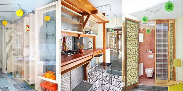
Not only they are not incompatible, they belong together. There are spaces intended for the photography and they are not comfortable, for the ‘tyranny of the eye’ to judge the quality of the design. We communicate through photography or videos and we leave out subjective feelings that are easier to perceive when you are in the space: acoustic, lightning, temperature…
However, when you work towards comfort, spaces are more beautiful and their beauty is more universal, because we have some similar channels of perception. The spaces where we have better comfort standards are the ones everyone told us to be aesthetically nice. And many people said they didn’t like spaces in which some technical aspects gave us more trouble, because they were more complicated projects. Putting together aesthetic and comfort is an ensuring universality.
- Your studio designed the VIP Room of ARCOmadrid, now Casa Decor Auditorium. Nowadays is the temporary architecture necessary to architects? Does it give you more freedom to develop creativity?
Yes, it is very necessary, especially in the youth section of the profession. Architecture is a field with a lot of legislation, economic pressure and a very serious commitment to quality. To many young people it would be impossible to start building because they need previous experience. Not just in Spain, but in the rest of the world, temporary architecture became the door for young boys and girls to prove they are not just good at conceiving, but also at delivering, meeting deadlines, dealing with budgets, being able to communicate something through architecture… That is basically what the customers want when they entrust you with a building.
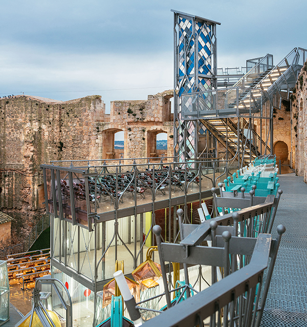
Plus, it has the advantage that deadlines are much faster. We developed a project, the renovation of the Castillo de Garcimuñoz (Garcimuñoz castle), for the Ministry of Development, on which we have spent 13 years. Casa Decor did it in 21 days. This gives you a higher flexibility as for making assumptions, targets and obtaining results almost immediately. Those of us who develop a more experimental architecture need a lot from evaluation and the fastest projects give us a lot of information. In Casa Decor you get a very important mass feedback: you receive visits, the visitors vote, make comments, there is a jury… Ephemeral architecture helps know what works and what doesn’t and generates a larger communication with society.
The gender gap in architecture
- How does a young woman get into the architecture world?
In Spain, there are very few women running architectural firms, although there are many women incorporated into a firm as wage-earners. I started with my own studio and here are very few cases, because there is a glass roof and because many women work with their husbands. There is a false perception that things go well but it is not true and it needs to be said. There is a wage gap that in countries such as England is at 25%; it is very hard to get contracts because you inspire little confidence and you have to demonstrate seven times more than a man. It is really hard for a woman and there are many factual data: in Spain there are 400 tenured architects out of which just 2 are women.
- Is it the architecture made by a man different from the one made by a woman?
There are many theories about it. One theory says there is good and bad architecture, regardless of whether is made by a man or a woman. There are also international studies saying the opposite. I believe that a man and a woman are biological, neuronally and culturally different. In general, architecture made by women is more sensitive towards social issues and more sympathetic with the user who is going to live in that space. Women are trained to face complicated problems: they are very good at dealing with many material systems and elements. Raised in a domestic culture, we are more careful with aspects considered decorative: we work better with light, colors, textures and finishes. There are many examples. Patricia Urquiola is an architect active in an interior design that no good man architect would be able to do, because he would not have the same sensitivity to the details. We also have more affinity towards nature and we are good landscapers. In general, women are good at what contemporary architecture lacks. We have to realize it… the others have to realize it too and until then… let’s hire ourselves!
- How do you value the presence of woman in Casa Decor?
The interior design world is different, it was much more kindred because socially women are much more accepted to work inside the house. In Casa Decor there are many women, but still it is hard to get equality: in many activities in which I take part I still feel like the only woman in the picture.


