We’ve already told you how ugly fashion is at the moment. Today we are bringing you five examples of the ugly movement in decoration and design. Because beauty is more than perfection.
Maia Home. Valuing the imperfections of wood
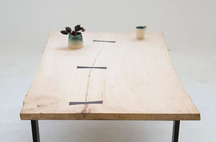
Wood is a natural material with characteristics like knots, cathedrals, and cracks, which make each piece unique, even those that come from the same trunk. These “imperfections” give each piece its own unique personality and are being appreciated more in a world that values anything different. Maia Home spotted this and designs and makes tables, chairs, stools, and coat racks using the “ugliest” woods, meaning those discarded by the rest of the market for having a higher number of irregularities.
Furniture with Venetian poles
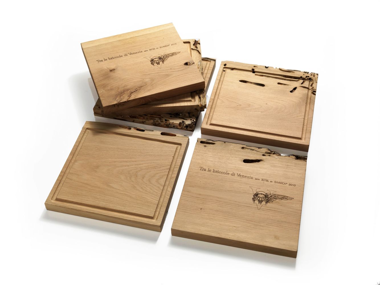
Recycled wood is another type of wood that is becoming more highly regarded in the making of personalized furniture with character. Here you can see a house covered in wood from flat-bottomed boats. An Italian version of this made use of wood from the poles of the Venetian canals. “Le briccole di Venezia” is a project by Italian manufacturers Riva 1920 where they invited highly acclaimed names in design like Philip Starck and Matteo Thun to design limited edition pieces using this wood, on which one can see the marks left by water and molluscs.
Kintsukuroi: the beauty of scars
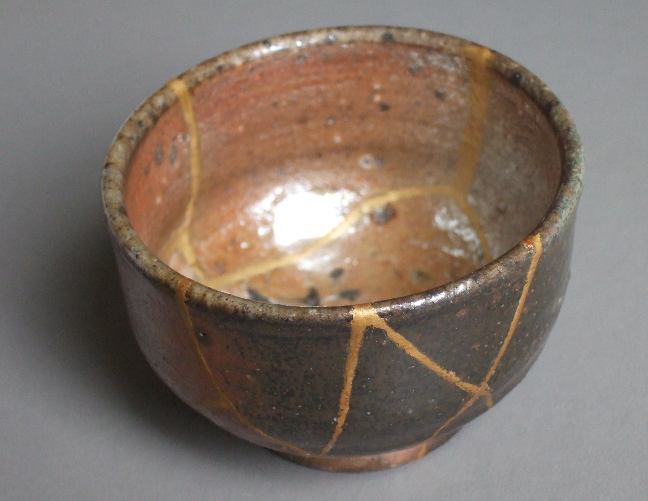
Kinstugi or kintsukuroi is the Japanese art of repairing broken ceramic pieces using lacquers mixed with gold. The purpose is to make the “scars” visible instead of hiding them, given that they now form part of the object’s story and embellish it. Closely related to the Wabi-Sabi philosophy, this art places value on the passing of time and the imperfections that it brings.
Gaetano Pesce: unique furniture
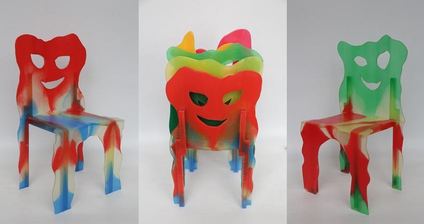
Since the 1970s, Gaetano Pesce has celebrated the idea of malfatto, or badly made things, as something positive. The Italian designer is one of the biggest champions of the beauty found in imperfections and he also advocates for its inclusion in modern industrial processes. His “Dalila” chairs are a good example. Made for Cassina, the machine operators involved in their fabrication decided on their final shapes. His Dear Diversity chairs are another example. Are they ugly? Are they beautiful? One thing is for sure: this furniture won’t leave you feeling indifferent.
Viva la diferencia!
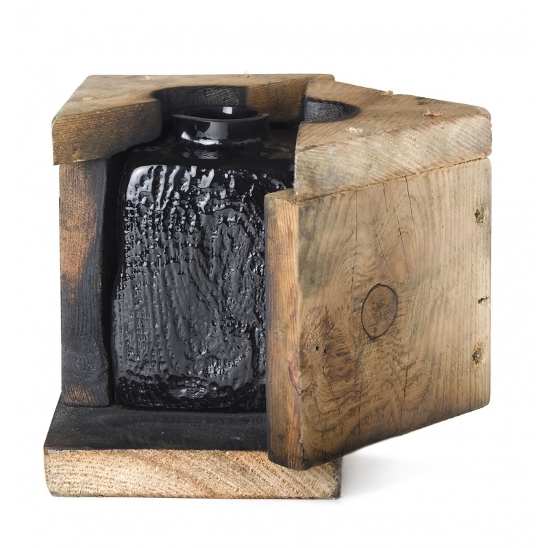
Pesce was actually one of the protagonists at the “Viva la diferencia!” exhibition, which we saw at the most recent edition of Madrid Design Festival. According to Ana Dóminguez Siemens, the organizer of the exhibition, it was born out of a growing desire amongst designers to run from standardization. One example is the Douglas vase by François Azambourg which is made from blown glass inside a wooden mould that deteriorates and changes with use over time and leaves a different pattern on each vase.
