Are our homes prepared for the “new normal”? We are probably asking ourselves this question a lot more often now. Maybe isolation has helped us answer it. This health crisis has changed our habits and has made our homes the epicentre of our lives.
Our homes have become multifunctional spaces. They are living spaces, offices, playgrounds, schools, and more. The fact that schools have closed has turned the home into a school as well. Lockdown has caused a resurgence in movements like homeschooling, flexischooling, and the century-old Montessori Method, which we have already spoken about here at Connections by Finsa.
Having suitable spaces is essential for any of these options, which is why architecture and design are key to achieving “the perfect environment”.
“The first task is to shake up life, but to leave it free to develop”- María Montessori
Creativity, curiosity, and autonomy
The objective of the Montessori method is to have the child self-educate, respecting their individuality and encouraging independence, self-esteem, and confidence. In this way, children have the freedom to explore, learn, and navigate their worlds by themselves. Their environment and the objects that they interact with play an important role in achieving this objective.
Everything must be ready so that they can interact with their surroundings in a spontaneous way. In order to facilitate that kind of autonomy, the design, both of the furniture and the space itself, must be planned out. It’s about helping them develop their creativity, curiosity, and autonomy in classrooms, the home, and public spaces.
https://www.instagram.com/p/B9dF_rkhn0Q/
Educational design
The Montessori method has inspired designers and architects to make the home a place where little ones can develop their potential. At Connections by Finsa, we’ve already shown you a few examples of this, like Cucuducho, where the design of furniture and toys is dedicated to education in order to help children’s cognitive development.
The environment must be structured, respectful, and calm. For this reason, their designs are based on simplicity, minimalism, organisation, accessibility, safety, and silence. These are guidelines that tend to applied to children’s bedrooms in particular.
https://www.instagram.com/p/B6EDi4MJZjA/
What does the ideal bedroom for a child look like?
“We use a slogan that sums up the answer to that question perfectly: el mundo a su altura (‘the world within their reach’)”, says Martín Geretto from the design department at Muebles Ros. With a line that is that is inspired by Montessori, the company provides the key to designing the ideal bedroom for a child.
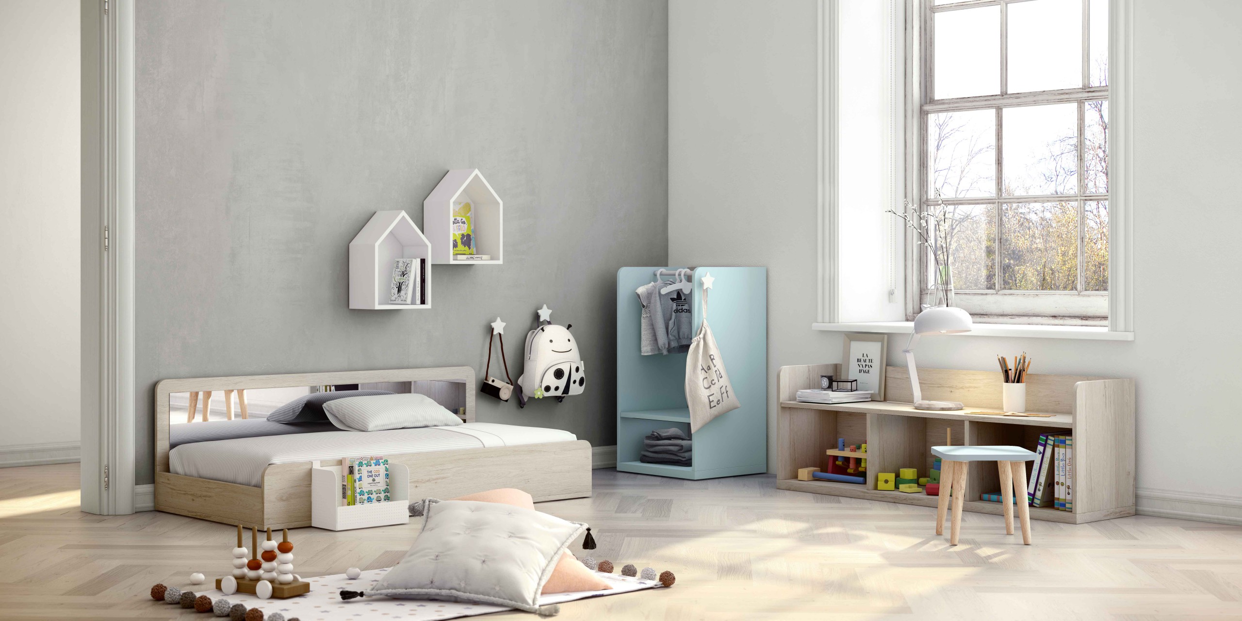
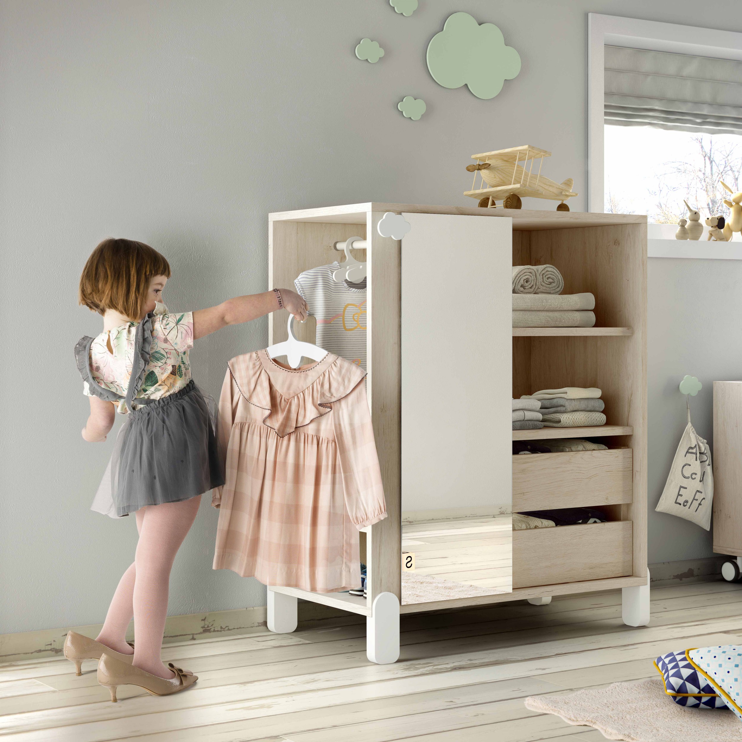
Furniture that’s the right size for them, is accessible, and has no barriers allows them to have greater freedom. Beds at floor level, a mirror to help them discover themselves, a reading corner, and wardrobes without doors to facilitate organisation – all of this within their reach.
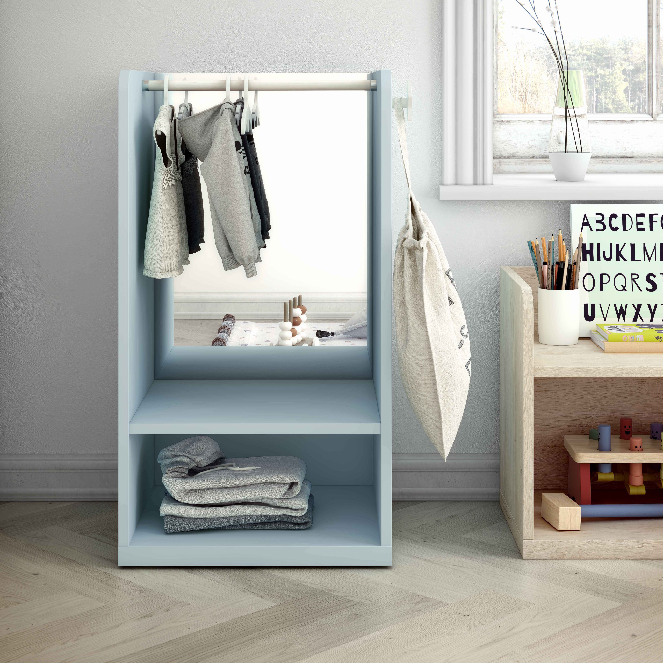
The main characteristics of the furniture are a transparent function and its size.
“Everything needs to be within their reach, which is why the dimensions of the furniture are key to the interaction between the object and the user. Alongside this premise of everything being within their reach, the visibility of things is also important. Our furniture is designed so that the little ones can see their toys or their clothes at all times. There are no doors or closed drawers. Everything is visible so that they can easily see their belongings”, says Geretto.
Materials and colours that transmit calm
Functionality is not at odds with aesthetics. Unique pieces can be made using materials that transmit serenity and that are soft to the touch. Wood also plays an important role.
Colours also have an influence. Designers point out that neutral colours are better because the furniture will be used to organise different types of objects, from books to toys to clothes.
“These objects already feature a variety of colours, shapes, and textures, which must be presented visually to the child in a serene way. If we were to use aggressive colours for the furniture, we would be creating a negative sensory experience for a small child that cannot process more than one experience at a time”, explains Martín Geretto.
The world within their reach
If we want to take the children into account when designing our homes, we shouldn’t just focus on their bedroom. Everything in the home must allow the little ones to be autonomous.
“Help me do it by myself” María Montessori
Adults must help the child during the learning process and the surroundings must be adapted. We can find many ideas for every space in the home so that the child, in addition to being an observer, can participate in an active way too.
Muebles Ros have designed a few pieces for this purpose, from a “hygiene” unit next to the bathroom sink so that the child can have some independence when carrying out their personal hygiene routine, to a learning tower to encourage interaction between children and adults in the kitchen.
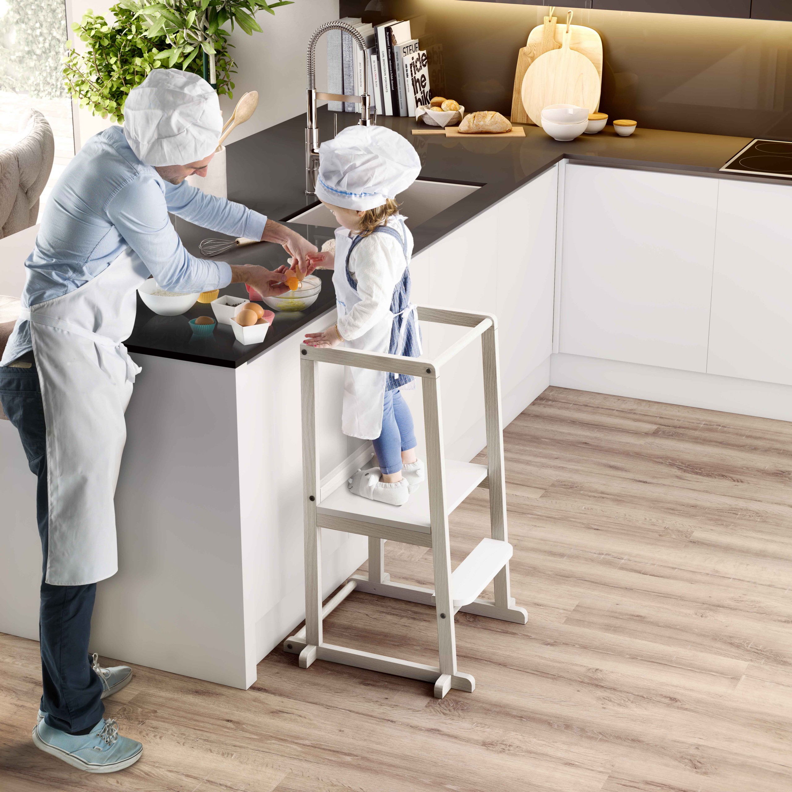
Functionality and aesthetics
Isolation has definitely changed the concept of a home. It has helped us reflect on the need to restructure the house so that it adapts to everyone and everything. It’s a multi-use space where the little ones can also feel comfortable and safe, and where they can learn and develop new abilities.
The home is their operations centre, their playground, and where they learn. Homeschooling, a common and regulated practice in other countries, is being promoted in Spain by several organisations as an option for the future. Whether or not you are a supporter of these trends in education, this new concept of the home is here to stay.
https://www.instagram.com/p/B4zFJWPgSTP/
Consequently, furniture for children has taken on greater significance. Designers have a new challenge ahead: putting themselves in the shoes of children and presenting new and creative ideas that contribute to the development of the child while taking care over the aesthetic. This means aesthetics and functionality, but from a child’s point of view.


